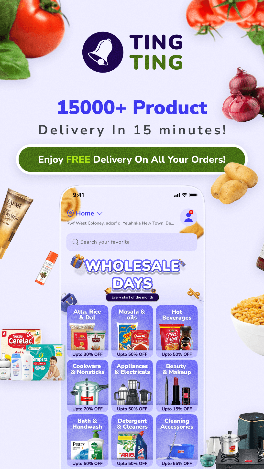
TingTing
Redefining Hyperlocal Delivery with Warmth & Speed
In India’s crowded quick-commerce space, TingTing needed to stand out—not just with 15-minute deliveries, but by making users feel at home. Here’s how we blended speed with warmth to boost retention by 70% retention & 10,000+ orders in first lunch
My Role:
Founding Product Designer
Year:
2023 -2024
Team
1- Product Design, 3-Developer, 1- Project Manager
12K+
Downloads on iOS & Android

"Fast delivery, great deals and fast response from customer service!"

20k+
Orders has been deliverd
Intro
As Bangalore's trusted supermarket chain,
Royal-Mart noticed customers wanted both speed and familiarity - quick deliveries without sacrificing their neighborhood store's reliability.
While competitors built expensive dark stores, we transformed our existing physical locations into hyperlocal fulfillment hubs through TingTing. Our Flutter-powered app delivered:
10–15-minute deliveries
Real-time inventory from nearby Royal-Mart stores
Leveraged Royal-Mart's 30+ neighborhood stores
One codebase for faster iOS/Android updates and cut development costs by 40%
While doing researching and spending time with users we find interesting behavior
30/20 Users, when they arrive on the app they have clear intent—their prefrontal cortex (the brain's CEO) is primed for a quick decision. But present too many options and:
Cognitive Overload
The prefrontal cortex gets flooded (like a RAM overload)
Mental fatigue sets in within 8 seconds*
Attention Drift
"Wait, why did I open this app?" (sound familiar?)
Working memory gets hijacked by shiny distractions
Exploration Mode
Now browsing, not buying
Dopamine-driven curiosity replaces goal-directed behavior
Last-Minute Panic
Finally ordering when time-crunched → rushed decisions
Consequences:
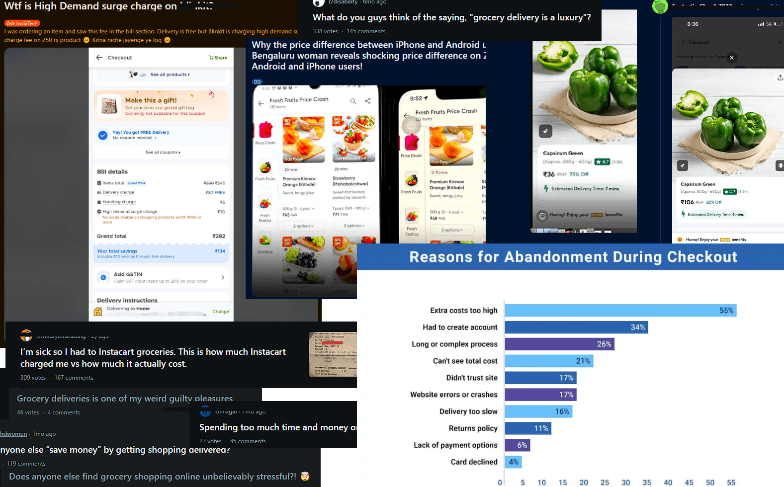
23% higher regret rates**
2x more abandoned carts during peak hours
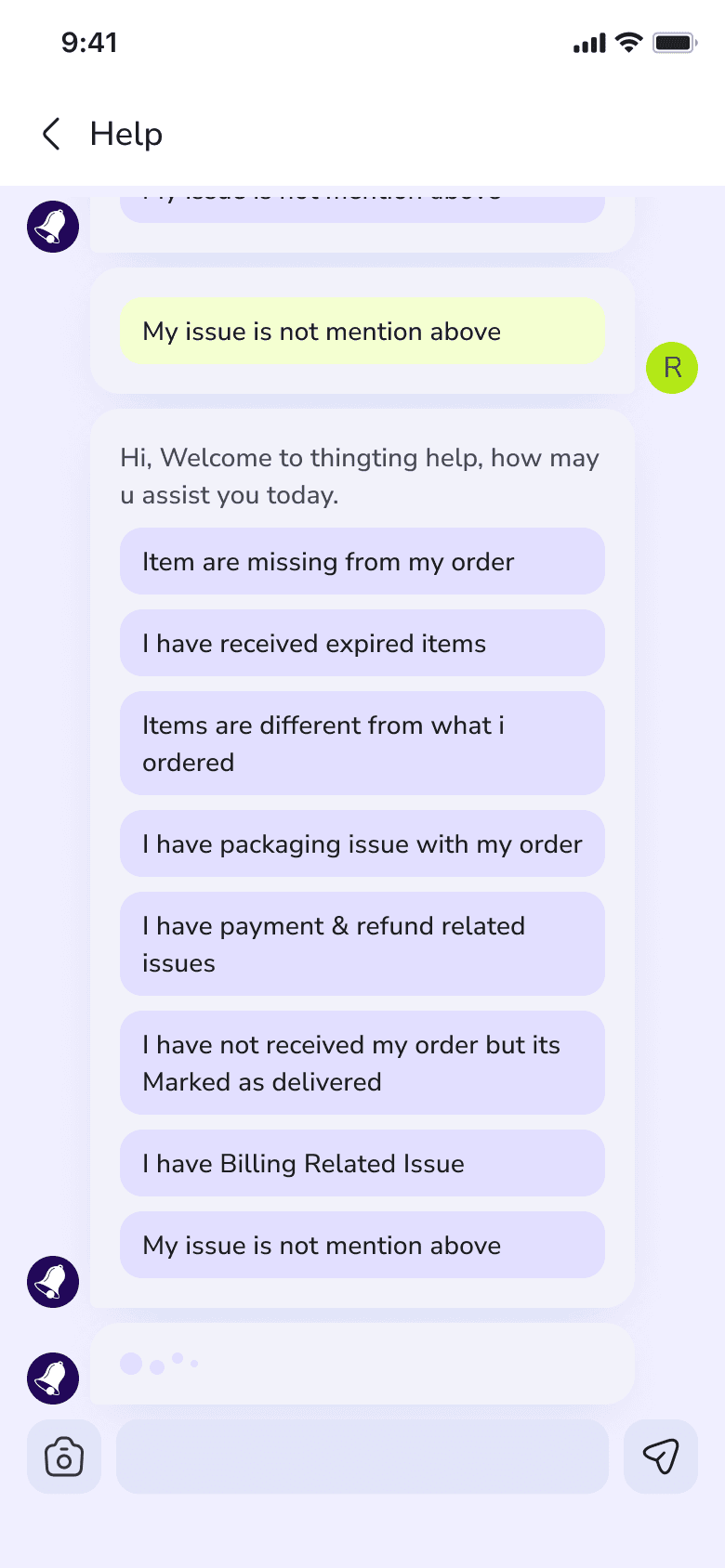
The Challenge:
What Users Said:
"I waste 15 mins Searching for a product in apps to find Product I'm looking for" – Working professional, 28
"Delivery fees make me feel guilty for needing groceries." – Young couple
Data: 47% abandoned carts due to shipping costs
Business Goals:
Compete with quick-commerce giants while staying true to our no-markup values.
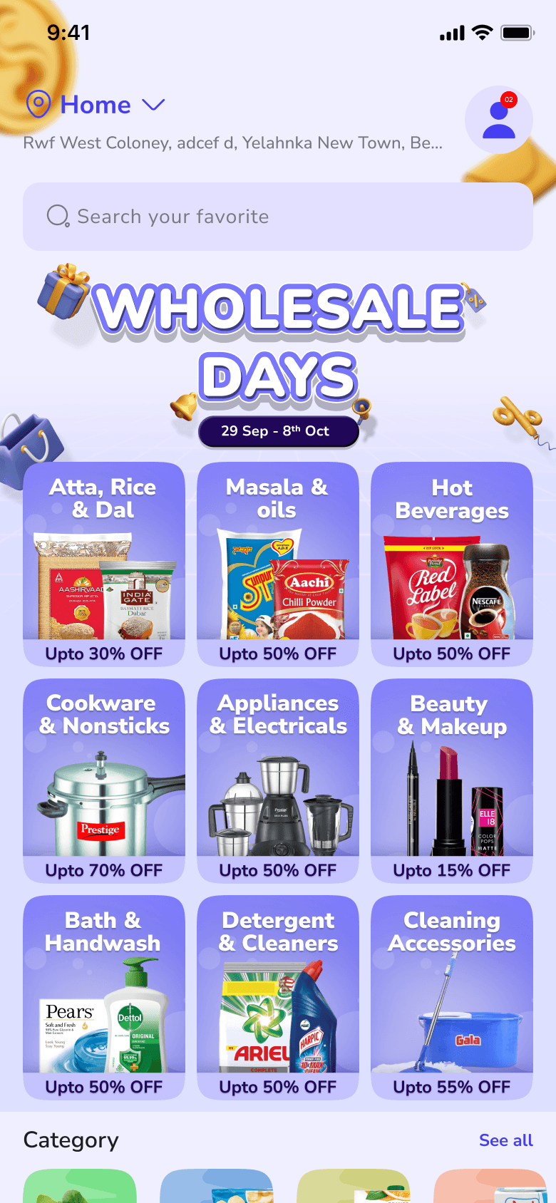
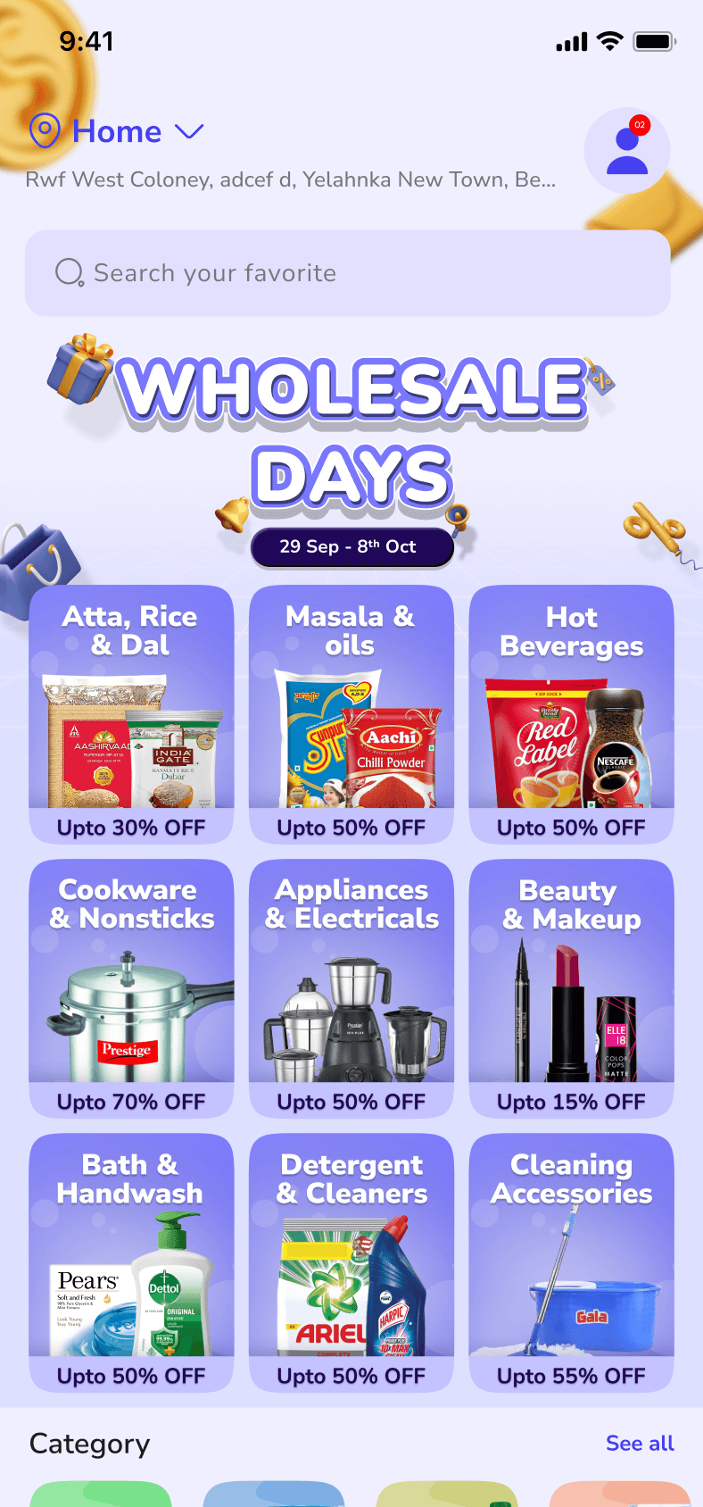
The Solution: Clarity Over Gimmicks
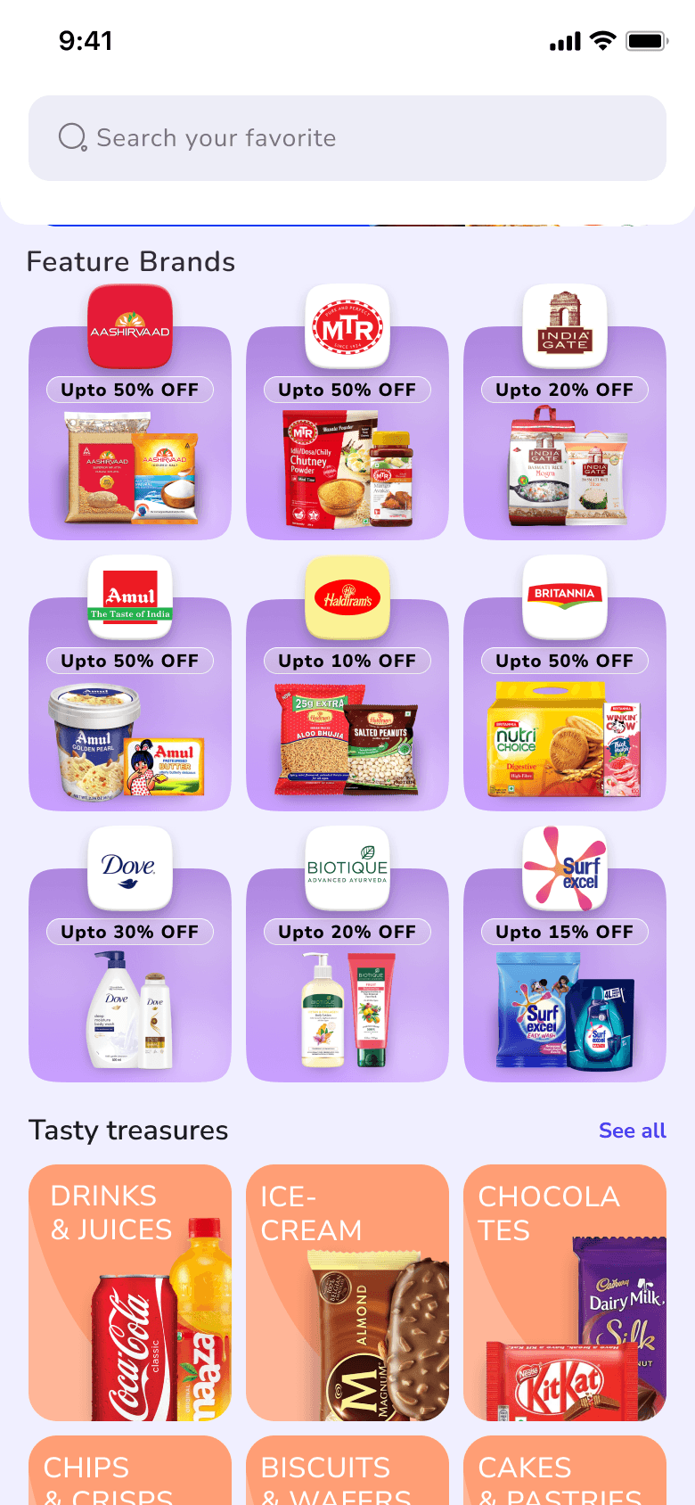
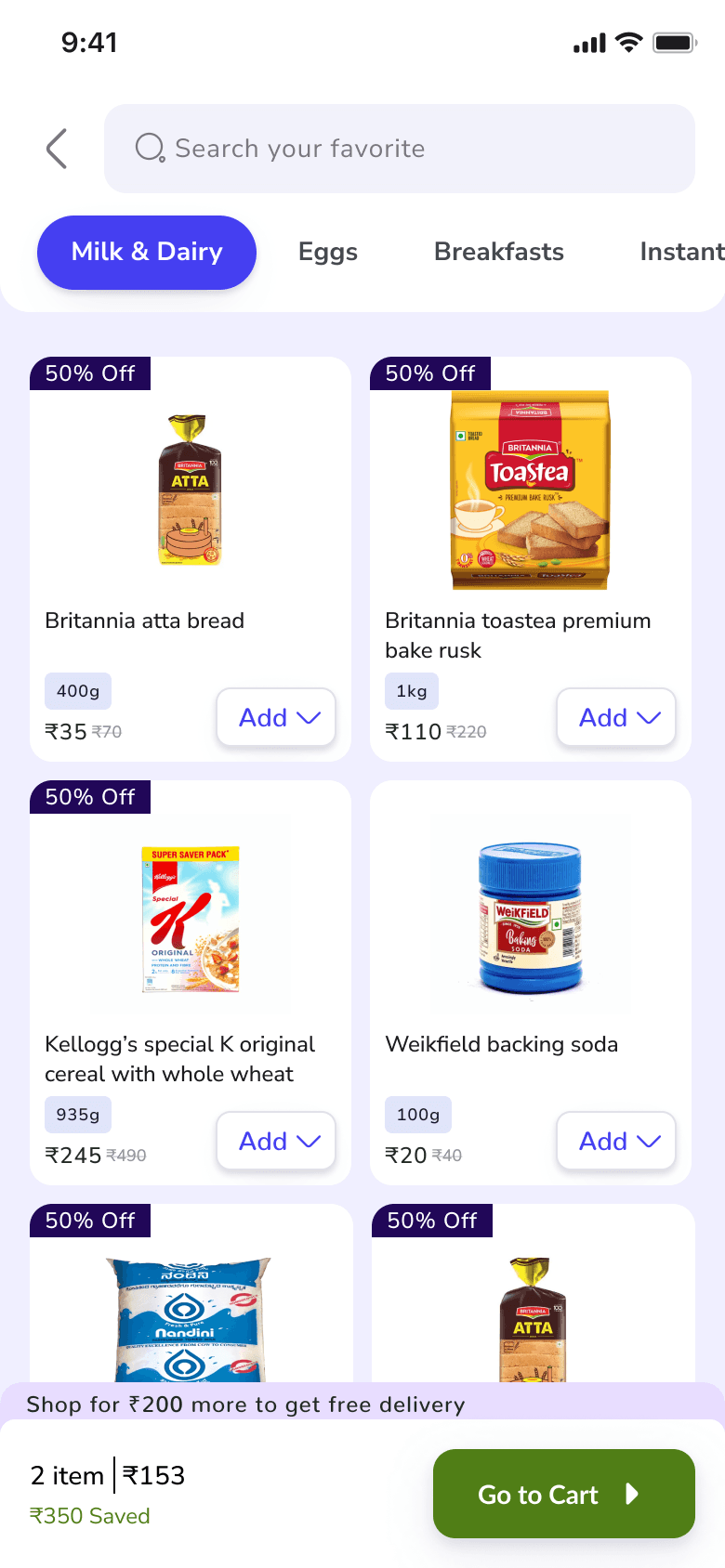
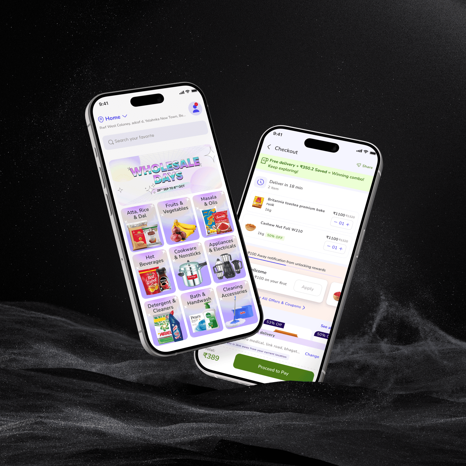
Family Bundles (Duka)
Grouped essentials like dairy, cleaning supplies, and kitchen staples—just like walking through your favorite supermarket's sections, but with tap convenience.
Flutter Framework
Ensured price consistency across all platforms – saved 30% dev time (and 100+ team chai breaks)
Fair Pricing Lock
Same prices on all devices to eliminate distrust
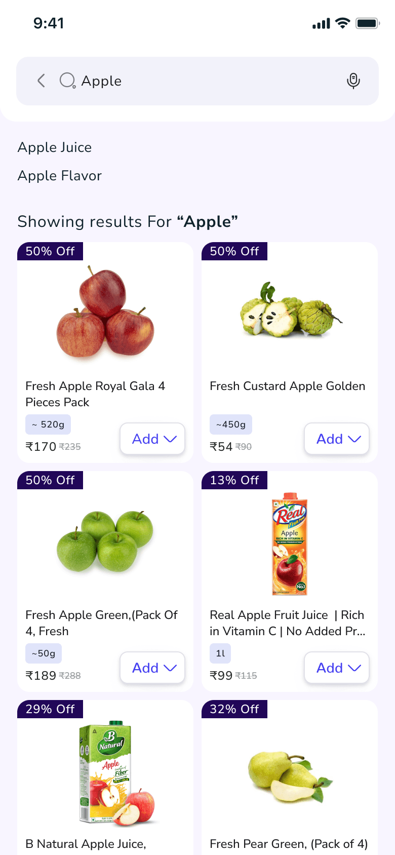
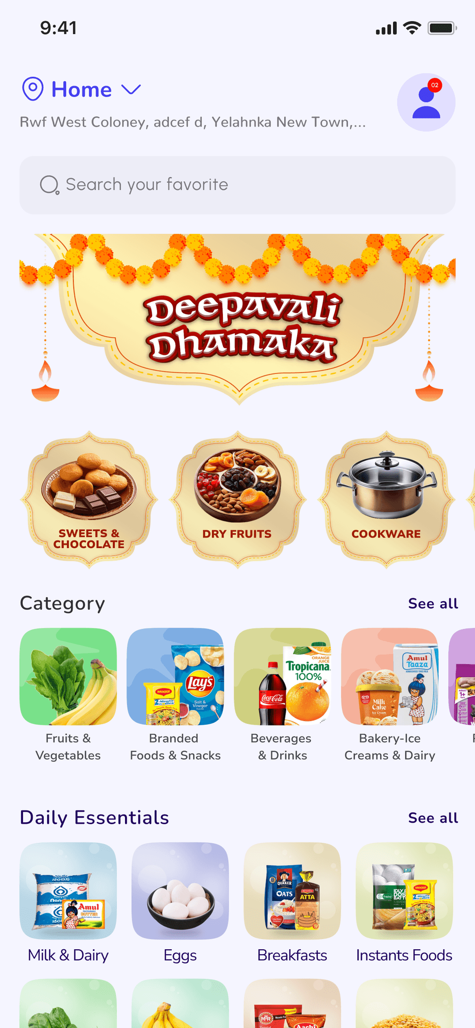
A mindful search experience:
Minimal search bar (reduce initial friction)
Minimal bar, exact matches first, and suggestions only after typing—reducing cognitive load while respecting user intent.
Information is everything
One wrong placement and the experience fails. That's why we obsessed over information architecture first, carefully positioning every element to naturally guide users toward their goals without friction.


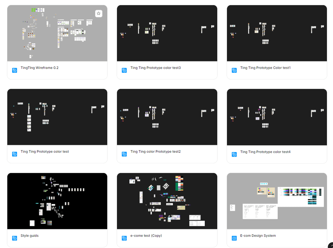
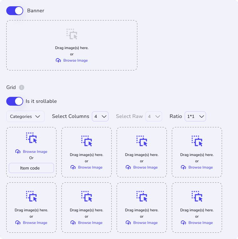
Structuring Information
To validate our information architecture, we design complete black-and-white wireframes - stripping away visuals to focus solely on information flow. This allowed us to:
Test core user flows with real users and stakeholders early
Gauge development feasibility and timeline realistically
Lock in essential features (while flagging nice-to-haves)
Ensure a functional experience even in scaled-back versions
From Wireframes to Polished UI
With wireframes approved, we parallel-tracked backend development while implementing Flutter's Material Design system - leveraging its seamless compatibility, customizing theme & components for our brand, and ensuring UI consistency across platforms.
Setting Theme
We used Figma's Material Theme Builder to create our branded theme, then validated it through: User testing and WCAG contrast compliance checks
After refining colors based on results, we faced a technical constraint: only a subset of Material tokens could export to Flutter (.dart files). With a solo developer on the project, I meticulously ensured all design adjustments used only these exportable tokens to maintain implementation parity.


Interaction Design: Familiar Yet Purposeful
After setting the theme, we worked on interaction design - making sure every UI component was developer-friendly and built right. I created everything using Atomic Design principles, while ensuring each component worked exactly like users expect from other apps. This way, people just know how to use it without thinking, avoiding any confusion or complexity.
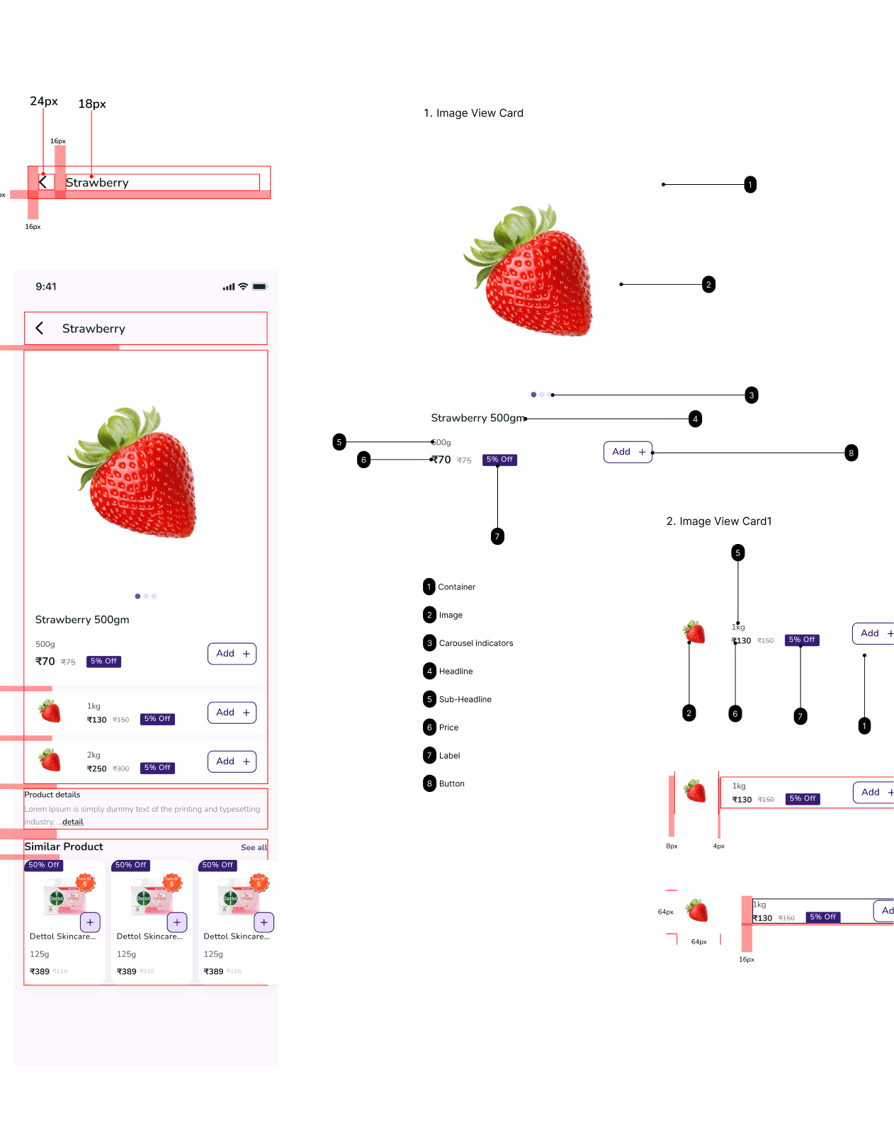

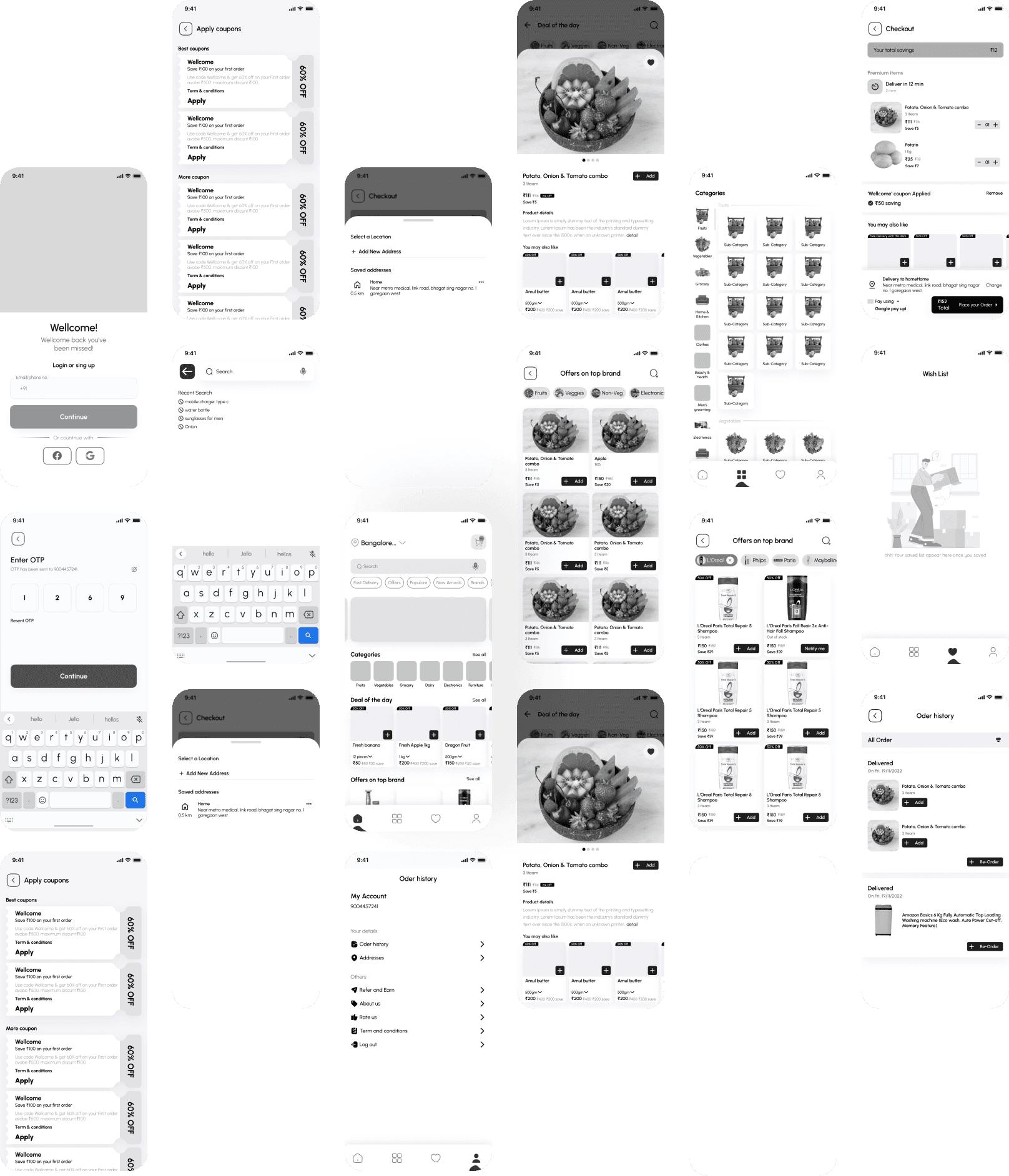
Let's Take a Closer Look Of the App
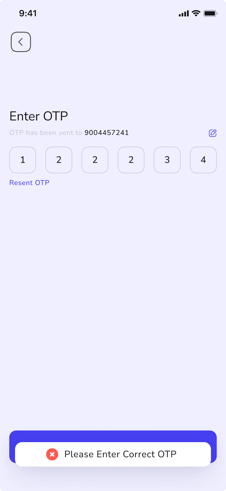
Phone-First Access
Register in seconds with OTP—just like other apps you use daily. Your number becomes your delivery contact and notification hub.
Guest Mode Welcome
Want to browse first? Shop as a guest—add items to your cart saved locally (even if you login later on the same device).
Instant Reward System
Share basic details (name/gender) during onboarding and instantly get a ₹100 coupon—helping us serve you better while saving you money.
Performance Boost
Cached cart data means faster loading after your first visit—no more waiting to resume shopping.
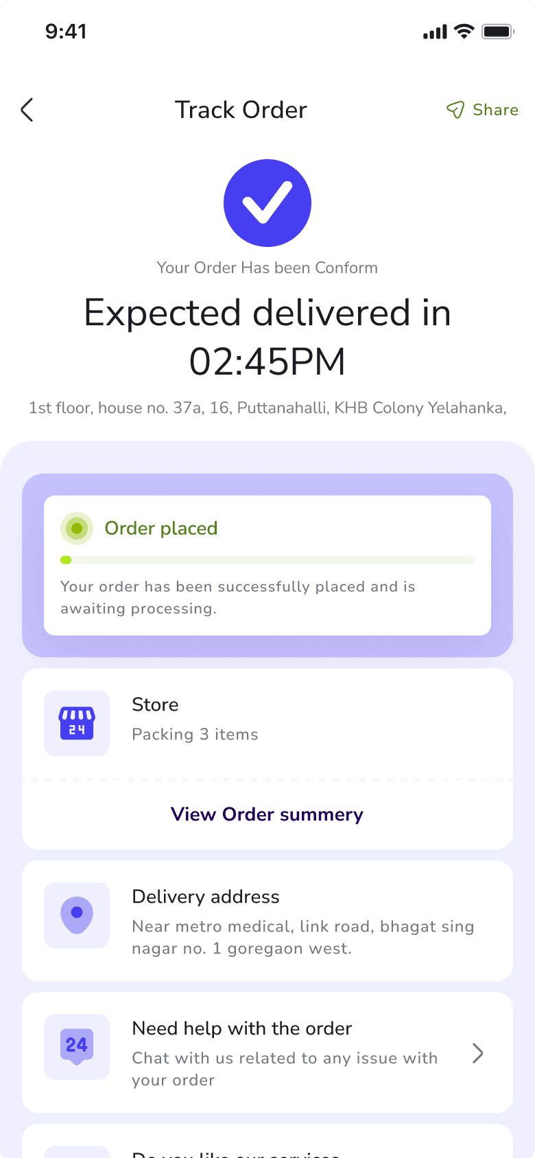
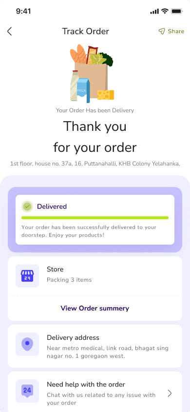
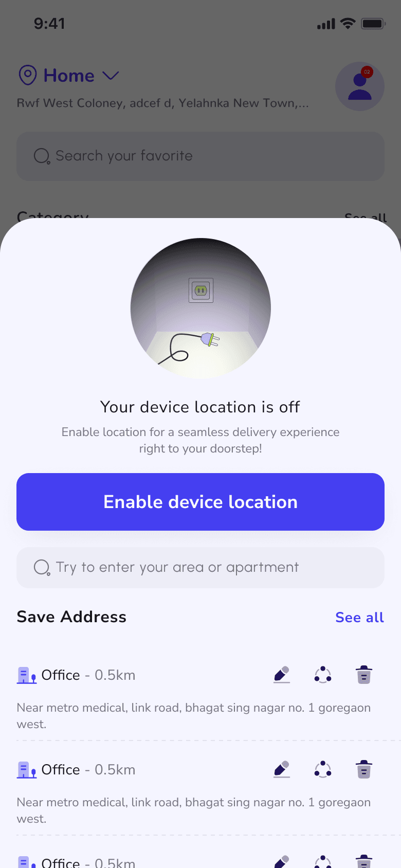
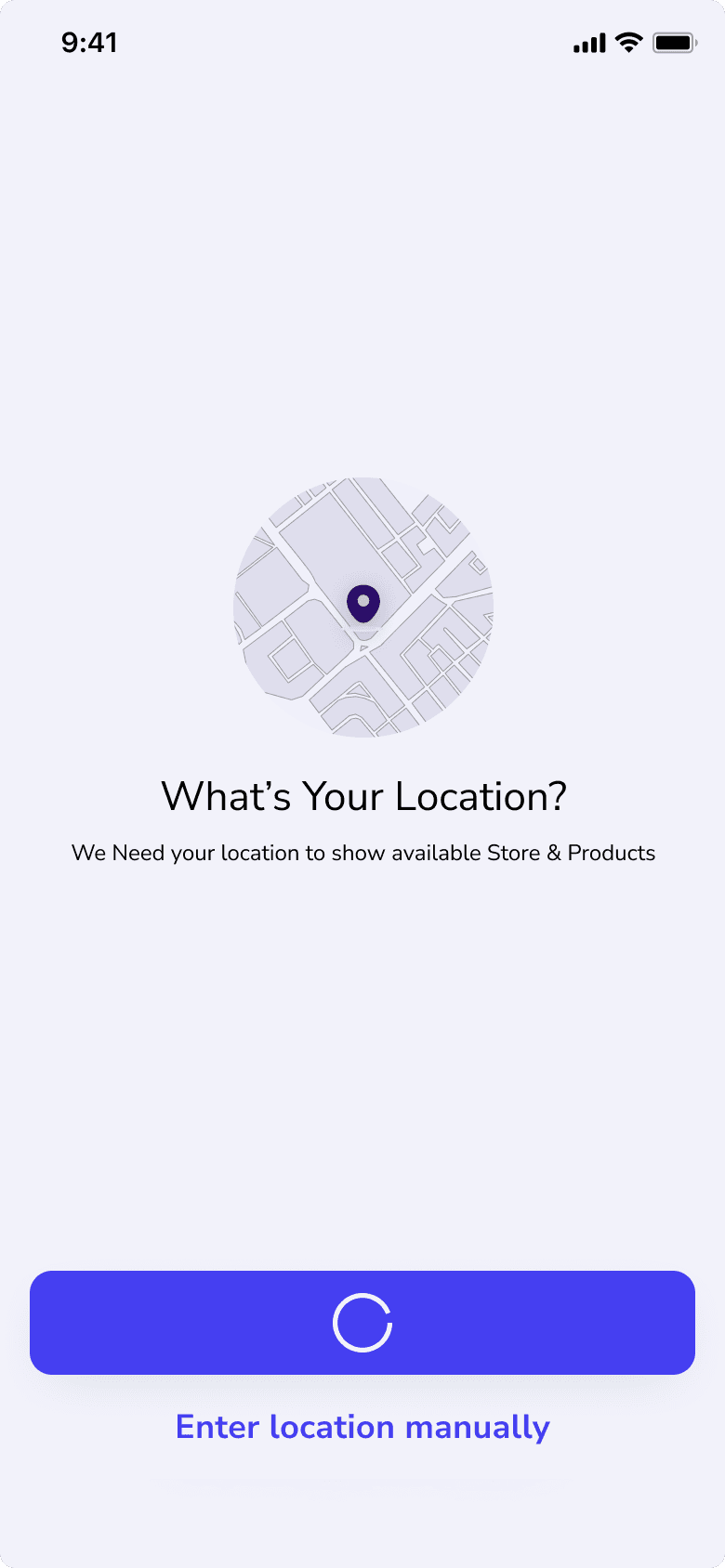
Location That Adapts To You
By default, we set your location for instant access, but you can always adjust it:
Two Selection Options
Pick manually from the map
Tap to use your current GPS location
Save & Switch Easily
All saved addresses stay accessible
Change locations anytime (perfect for ordering to work or family homes)
5km Radius Guarantee
We automatically connect you to stores within 5km
Ensures reliable 15-minute deliveries
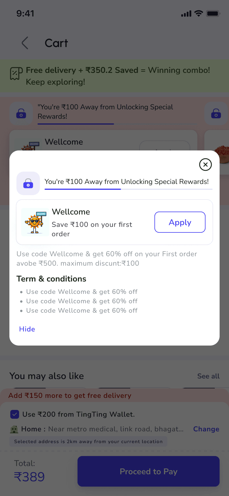
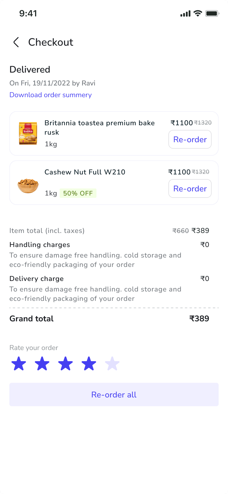
Checkout: Speedy & Rewarding
Delivery Urgency
"Deliver in 18 min" promise
Free delivery + savings highlighted ("₹350 saved!")
Clear Progress
"Add ₹200 more for free delivery" nudge
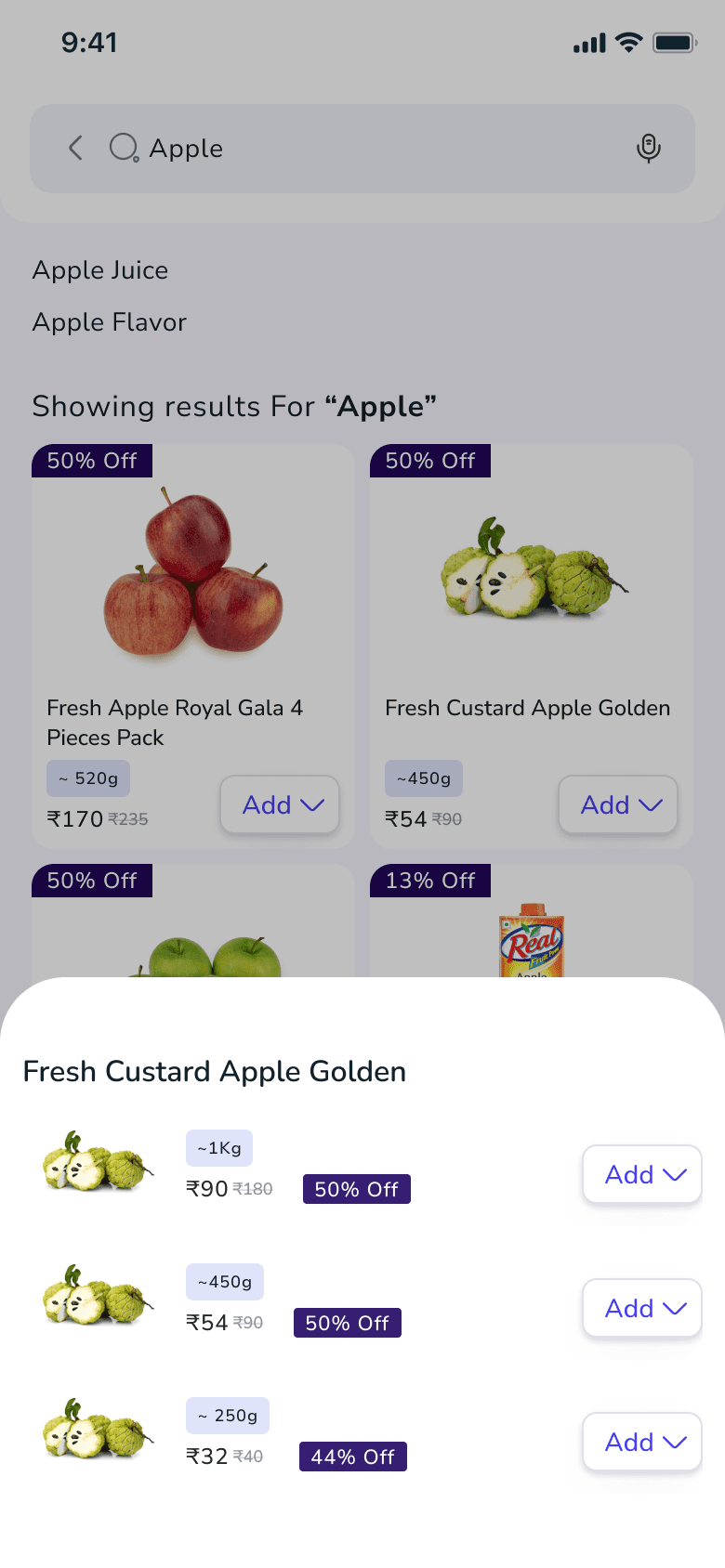
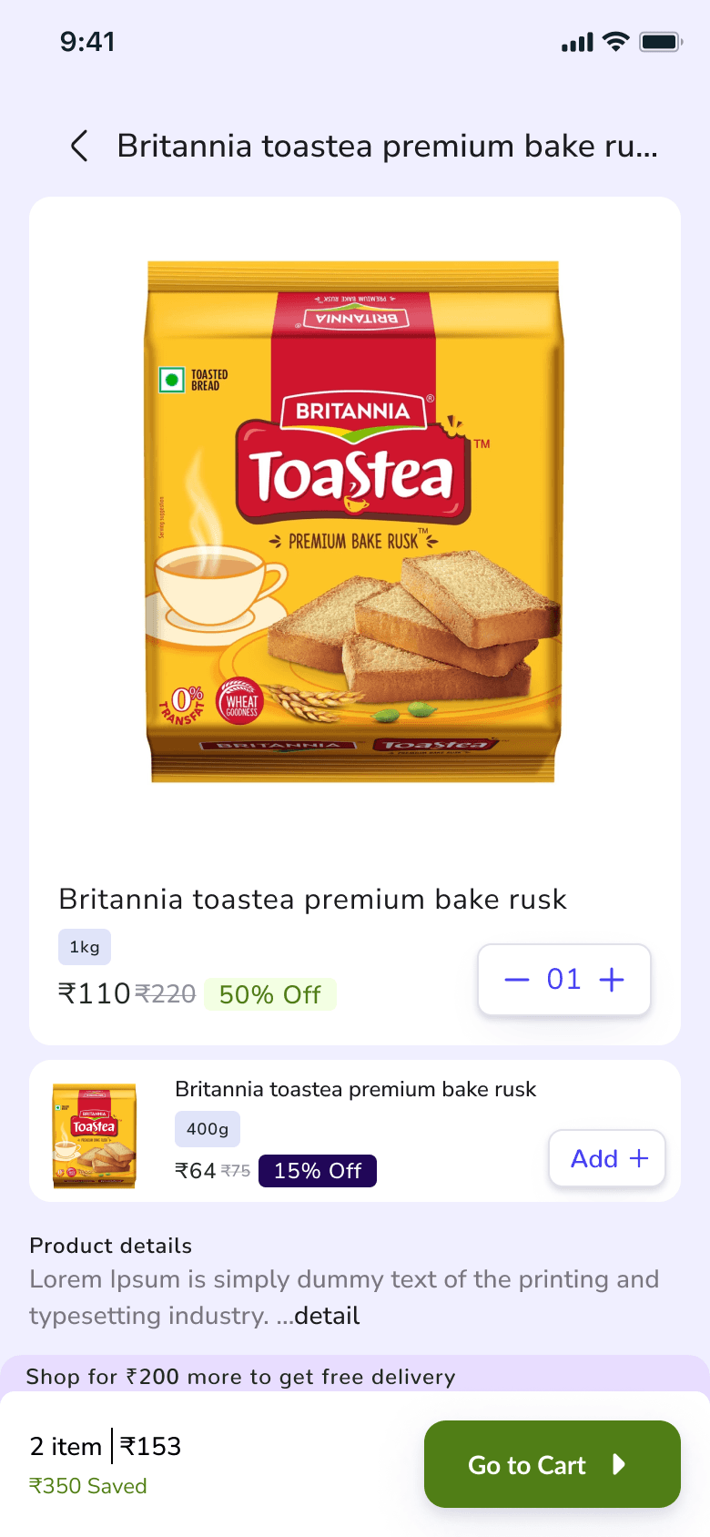
Itemized costs with simple (+/-) quantity controls
Frictionless Flow
Preset tip amounts (₹10/₹25/₹50)
Saved address with distance awareness ("2km away")
Smart Coupon System
Apply % discounts or "Buy X, Get Y" deals
Swap/remove anytime (1 active coupon at a time)